Last year's version of
College Football's worst uniforms featured a common thread of bad color schemes or poor helmet logos. The best uni's in college football belong to 10 universities with simple yet lasting designs. With the exception of Texas, all teams are sporting their home's. I used to consider the Florida Gators to have one the better looks
until I read this. Georgia was considered, but their Packer's G is shared. Honorable mention is Auburn.

1)
Penn State: Renowned for the lack of names on the jerseys or logos on the helmet, the Nittany Lions set the standard for college football's best uniforms. The throwback style that never left the field, Paterno knows a good look when he sees it.

2)
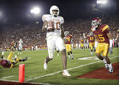
Texas: The away white's for the Longhorns are one of the best. The burnt orange numbers with a capitalized TEXAS across the front look sharp underneath the simple Horn's logo helmet.

3)
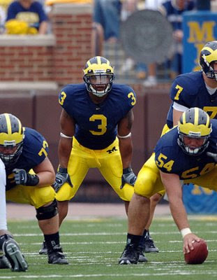
Michigan: The famed winged helmet look of the Wolverines is unique in college football with the exception of Delaware. The maize and blue is striking without any distractions; name and number, nothing else.

4)
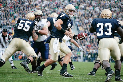
Notre Dame: The navy and gold look has been copied many times over, but none can claim to best the look of the Irish. The fact that they are known for a Golden Dome on campus and sport golden domes on the field makes this a top college uniform.

5)
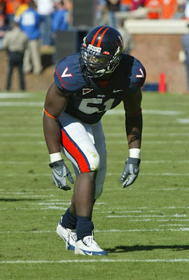
Virginia: The Cavaliers changed their look in the early Nineties from a script UVa on the helmet. The V with crossed sabers along withe the solid navy and orange is a sophisticated look for a pathetic program.

6)
Colorado: The Buff's have been Nike-fied lately but still retain a striking look. The CU buffalo on the helmet along with all black is a look copied by many of programs in their black alternative jerseys.

7)
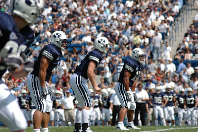
Brigham Young: After several years of futuristic looks, the Cougars from Provo adopted the Steve Young era look, albeit with a
darker shade of blue. The historic look sets it apart from it's counterparts in the Mountain West Conference.

8)
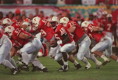
Nebraska: The plain font red N on the helmet and the red jerseys were an imposing sign on a wall of linemen. The plain, unadorned look is fitting for this corn fed squad. The look was perfect for the decades that the Huskers rolled out massive linemen and speedy I backs year after year, they all looked the same because they were.

9)
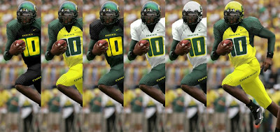
Oregon: How are the Ducks considered to be one the best uniforms? They are everything a classic uniform isn't, multiple colors, many variations. The Oregon uni's are among the best because of their unique status as divas of college football. A diva is never seen in the same gown twice and neither are the Ducks, they've got to be considered one of the best, they try the hardest.

10)
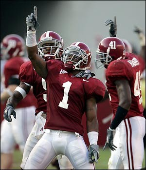
Alabama: One of the last programs to continue the numbered helment, Bama makes the list on that alone. Nothing particularly exciting, but distinctive and simple. Unchanged since the days of Bear Bryant, don't count on the Tide to make any changes in the future.
 Zac Lee has been the QB for the Nebraska Cornhuskers this season leading them to the Big 12 Championship next week. Putting up decent numbers, over 2000 yards passing, 14 TDs to 7 picks, Lee could have a big senior year in 2010. If you think that would make a father proud, you're right. His dad Bob Lee played 14 NFL seasons. But the true star of the family is older sister Jenna.


